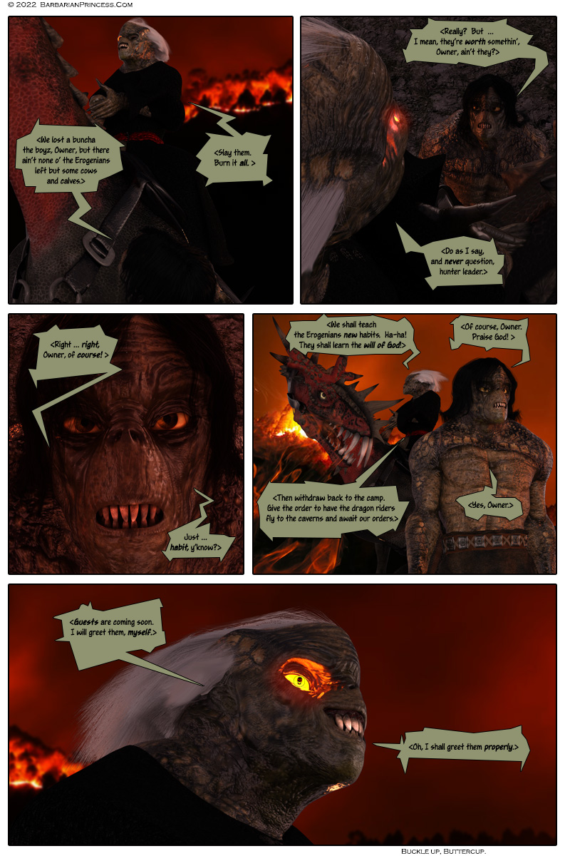
GALIKI. Gorshash is speaking to a subordinate Urtt
HUNTER LEADER: <We lost a buncha the boyz, Owner, but there ain’t nobody left but some cows and calves.>
GORSHASH: <Slay them. Burn it all. >
PANEL 2
HUNTER LEADER: <Really? But … I mean, they’re worth somethin’, Owner, ain’t they?>
GORSHASH: <Do as I say, and never question, hunter leader.>
PANEL 3
HUNTER LEADER: <Right … right, Owner, of course. Just … habit, y’know.>
PANEL 4
GORSHASH: <We shall teach the Erogenians new habits. Ha-ha! They shall learn the will of God!>
HUNTER LEADER: <Of course, Owner. Praise God. >
GORSHASH: <Then withdraw back to the camp. Give the order to have the dragon riders fly to the caverns and await our orders.>
HUNTER LEADER: <Yes, Owner.>
PANEL 5
GORSHASH: <Guests are coming soon. I will greet them, myself. Oh, I shall greet them properly.>


30 thoughts on “Toothy Grin – Page 1256”
MikeLinPA
Wow! They rendered differently with the new software. Less human and more menacing!
jedraft
Completely different model. 🙂 (Genesis 3, “Alien X”)
This is what we base the new Urtts on in our animated series.
Warm regards,
JED
Deceptobot
Are you sure these are gonna work for you? I mean, compare to the faces in the “I fear Ipola Queen!” episode. Their expressiveness totally sells the emotion. Today’s faces look utterly frozen, expressionless and neutral, like a fish. I trust you and your animators know what you’re doing, but today’s page gives me doubts.
Besides, I have a harder time believing these critters could interbreed with humans.
JEDraft
Give it time. They are not expressionless. It needs a little practice and a subtle piece of the story to show those off. Right now, Gorshash is in his “Nya-hah-hah” moment.
And yeah, most of the results of interbreeding don’t live, but it does happen. In this instance, it’s just more horrifying. Hell, look at some of the Hentai out there …
Warm regards,
JED
Reservist
So… Rudik and Nanda? Any news from them?
JEDraft
Soon.
Warm regards,
JED
FicWader
The owner now looks…. Horribly Derpy
Like horror rendition of cartoon blunt nosed dolphin or sperm whale
Also please, do NOT re-render Mentl’s hybrid seductress again, we have no need for that surely 😀
JEDraft
Thanks for the feedback. I think you’ll find that they’ll grow on you, especially as Brian has given me some new morphs for this model that will make them more human-like. (It grew out of the need for Zona to slice off heads and body-parts cleanly, interestingly. 🙂 )
And Ginsha is coming back, as a G8 Female, so no fear there. 🙂
Warm regards,
JED
Jim
Jed, I had to look at this over and over again, until I realized that it’s Gorshash. Both he and the other Urtt are static, flat, unrecognizable, and extremely disconcerting to look at. Up until now, they’d all been extremely expressive, with actual character growth visually tied to Gorshash; now, they’re much more generic and cartoon-y, but not in a good way.
I understand they’re based off of your animated series, but you’d literally spent decades establishing what each Urtt looks like, so why throw away all of those years of work? You should keep your comic and animated series separate from one another. Zona’s abrupt change-in-the-middle-of-the-night look was offputting enough, but if you don’t change all of her renderings and each and every Urtt’s rendering in the archives, then why bother? It doesn’t serve the story that you have created.
You George Lucas’ed your own creation.
JEDraft
I appreciate the comment, but I urge you to wait until you’ve seen more. The model does have its own expressiveness., so give it a chance.
We’ve been showing this in renders and animated clips for over a year in the Patreon site, and if you decide to become a patron there, you’ll see how they have evolved.
Warm regards,
JED
Inquisitive Raven
Add me to the list of people who don’t like the new Urrt renders. Also, ISTR that Gorshash had the more typically Urrt black hair albeit with a white streak. Now it’s all white and it looks horrible.
jedraft
Noted.
However, the reason his hair is all white is because he survived a blast of Erogenian magick right in the face. That choice was made in his previous appearance.
Warm regards,
JED
Calisto01
OK not going to comment on the “new” look for Urrtts, others beat me too it. But I do have a question about the new design. Previous to this Gorshash’s eye had been replaced with a flame. That’s it, just a flame, now the flame has a pupil and it appears the other eye it missing. It this the result in the near-face explosion? Did the hateful God grant him sight through the eye that was meant to be an eternal punishment and reminder of his failure? Just asking for a friend, seems a bit of a double standard saying “You done f*cked up, but I’ll let you see, see.”
Or is this a problem with the rendering?
JEDraft
It’s the lighting. His normal eye is in shadow.
Shuach’s face has been seen in the glowing eye before for dramatic effect.
Warm regards.
JED
RBZ
Tortoises. That’s what they remind me of.
In panel 3, Hunter Leader’s face reminds me a little of a green toned E.T. in a wig, but the general feel I’m getting is that they’re shell-less anthropomorphic tortoises.
Whereas before, they looked more like crusty-scaled Killer Croc lookalikes.
jedraft
Very good.
-JED
FicWader
Thats it! It was tortoise I had on the tip of my tongue, but had to settle for a blunt nosed dolphin 😀 never unseen
Lora
The commenter further up, who said they were fish-like, hit the nail on the head. They do look more like a hybrid of fish and reptile than reptile and human now. XD Not a fan so far, but I’ll give it a chance to see what happens going forward. Necks and heads look weird though.
I wonder if Gorshach knows Zona, Mentl et al are coming or if he’s just referring to the Erogenians in general? Also I wonder if Arch Gennach have talked to his mother yet? And what the response will be.
jedraft
Thanks.
-JED
Tiff Hudson
It’s a TRAP!
Some Ed
Yes, but I think Zona & Mentl expect it to be one. Not sure if that makes it better.
That having been said, I’d like to think they’re not expecting the results of the latest rendering engine.
Month
Yeah, stop gloating, you Palpatine wannabe!
jedraft
Well, someone is gonna be surprised.
Warm regards,
JED
Perechon
Sorry to say this, but I like the old renders more.
I think the body language of the pissed urtt underling doesn´t fit. Gorshash´s profile has changed to much, nobody would recognise him any more.
And Zona? Looks like a blonde Xena. Seems not to be as huge as before, and skinnier.
jedraft
Sorry.
-JED
Danekjovax
Interesting new renders. I’ll just sit back with my Mt Dew and popcorn and see how this all plays out. These 15 years of following you haven’t bored me at all. Thanks, JED!
Calisto01
I’ve been going back and forth and I think what bothers me the most with the new render of GorShash is his color. Previous to this he has been a combination of green hues that varied but allowed for his face to be seen clearly. Some of the green shades were quite bright in fact. With the new render it looks much more to be shades of grey, a lifeless color often used to represent undead.
To be clear the page is showing a nighttime scene and there is a lot of shadow. There is also the fact that his face is now the remnants that survived the explosion mere inches from his snout. His underling however also seems very grey and lifeless even when we see his full torso. Again nighttime shading but it still seems like they are missing some brighter green shades.
Just my $.02
DeadmanwalkingXI
For me, the issue is the change. Gorsash is an established character and this is effectively giving him an entirely new model that looks different with no explanation. Like if, say, Ipola was suddenly completely different looking with no facial similarities and different colored hair. The Urrts as a species are arguably an even more important character and similarly bear no similarity in appearance with no in-universe explanation for the change.
I would’ve been 100% fine with this look if they’d started out looking like this. I’m certainly fine with it for an animated adaptation, but changing midstream like this is like a TV show switching from actors with rubber foreheads to CGI models with inhuman proportions for the same character mid-season. Sure, the latter might be better in some objective sense, but the change makes it jarring and a huge break in verisimilitude.
Lora
Yeah, I ended up going back, too, and realized the switch from green to grey is a huge part of it. And that one just baffles me; surely it shouldn’t be a problem to keep the color scheme? All Urtts are apparently grey now …
Just imagine if Ipola was suddenly dark skinned with black hair! That’s about the same magnitude of change as this.
Chris
Having trouble even looking at the new graphics…I don’t like it.
Categories
Meta
Archives
Archives